Apollo
A retrospective case study on the process of tackling a giant project with an outstanding team.
After combining various adtech services under the Adcolony brand, the company wanted to unify its scattered offerings into one dashboard experience. This project—Apollo—would be a behemoth. Apollo touched all aspects of our advertising business, from on-boarding apps and running campaigns to monitoring metrics and tweaking ad settings.
Mindmapping
The first step was to create a visual representation of everything Apollo had to do. This involved generating a comprehensive list of each feature’s requirements and grouping the related items together.
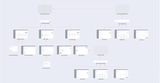
sitemapping
Mindmapping can only go so far, the next step was to start visualizing the product. In the sitemapping phase, screens start to be pieced together to create the optimal user flow.
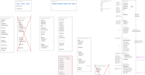
WIREFRAMING
After countless iterations, pages of text and gray boxes came together to form the first hint of a real product.
WIREFRAMING
Hey there, this is the default text for a new paragraph. Feel free to edit this paragraph by clicking on the yellow edit icon. After you are done just click on the yellow checkmark button on the top right. Have Fun!
WIREFRAMING
After countless iterations, pages of text and gray boxes came together to form the first hint of a real product.
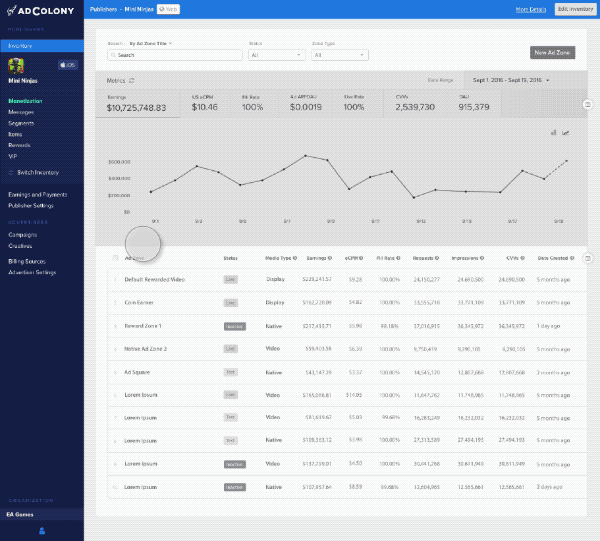
Prototyping
As page designs filled out, it became necessary to begin prototyping interactions. At this point, engineering and QA got involved to weigh in on what's possible, while product managers could start to visualize the end product.
This prototype explored options for viewing individual app metrics.
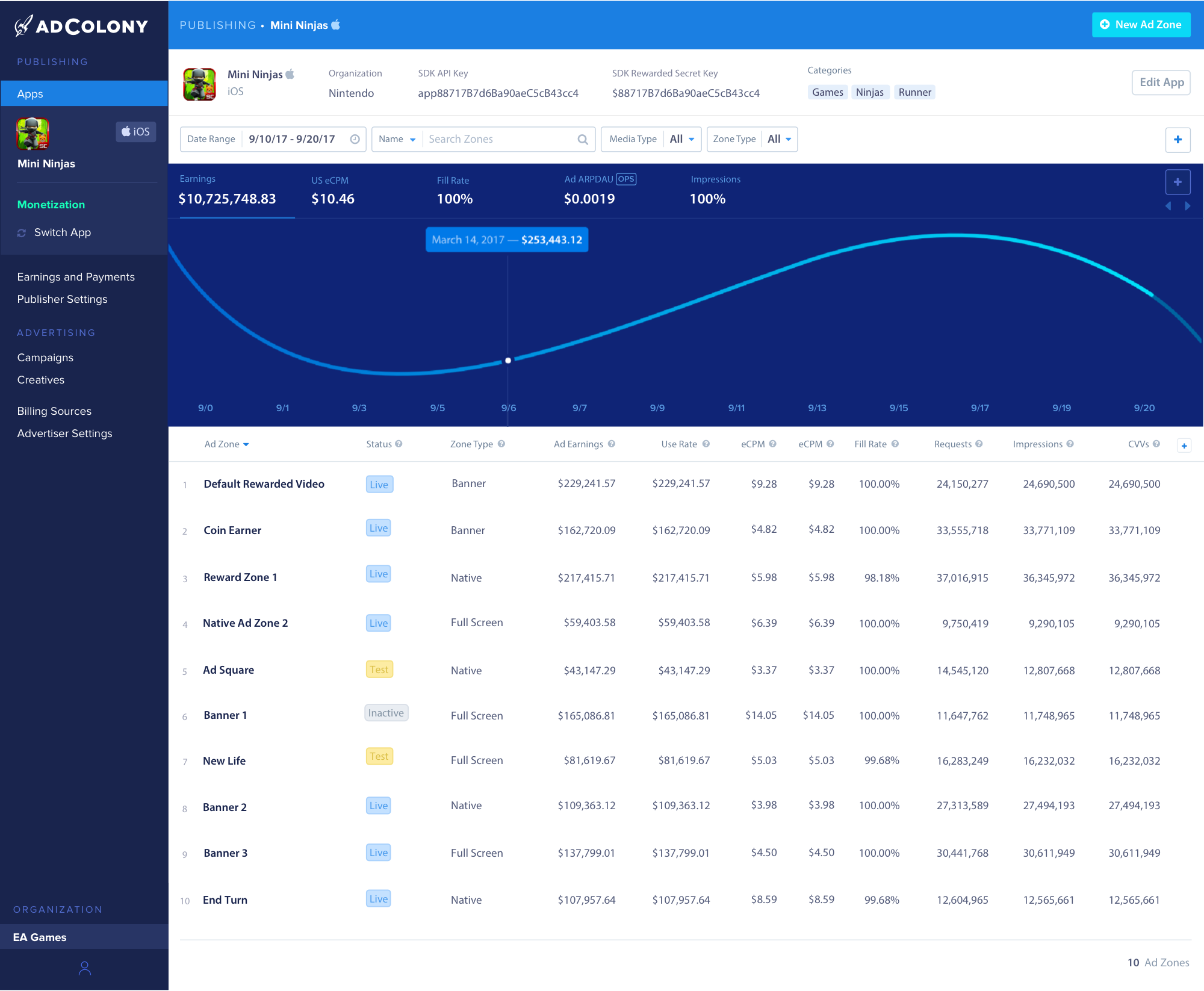
High Fidelity
With so much thought and experimentation in the previous steps, high fidelity mockups were a refreshing change. Adding colors, fonts, and styling made everything feel alive.
High Fidelity
With so much thought and experimentation in the previous steps, high fidelity mockups were a refreshing change. Adding colors, fonts, and styling made everything feel alive.
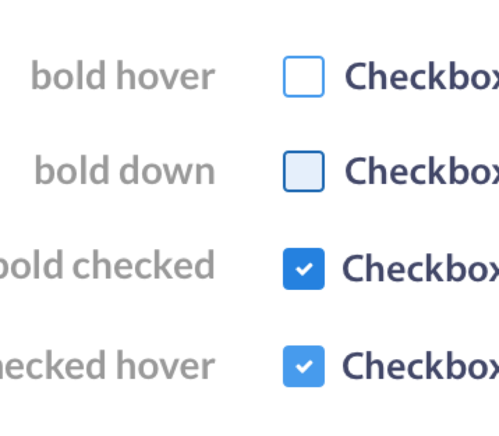
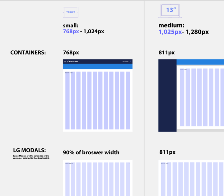
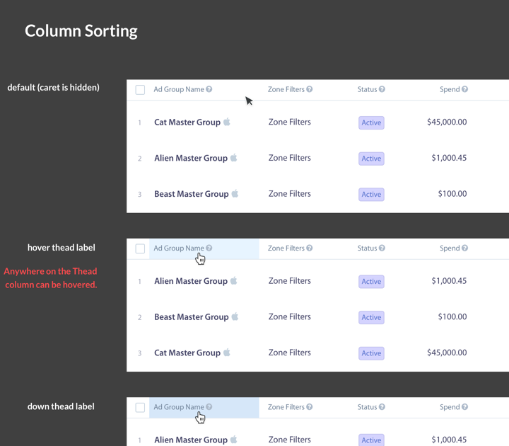
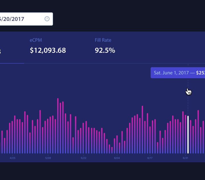
Style Guide
A project of this size required a collection of components to utilize throughout all the pages. With such a large number of screens and desired features, being able to drop in these established patterns greatly sped up the creation process. Typography, colors, inputs, and visual treatments are just a few of the designated styles in the Apollo Style Guide. From there, engineering developed a library of React components built on top of the Foundation framework, which was easily shared and refined across multiple teams.
Here you can see samples of the typographic styles, color swatches, UI input states, responsive frameworks, tables styles, and graphing styles that our team considered and considered again.

seallgood.ray@gmail.com
seallgood.ray@gmail.com
seallgood.ray@gmail.com
seallgood.ray@gmail.com