In 2016, Opera launched a companywide rebrand. As part of that effort, we remade OperaComposer, an internal tool used to format ad units and generate links for the delivery server. The catch? The current tool consisted of two very different interfaces run by separate teams, one in California and the other in Germany.
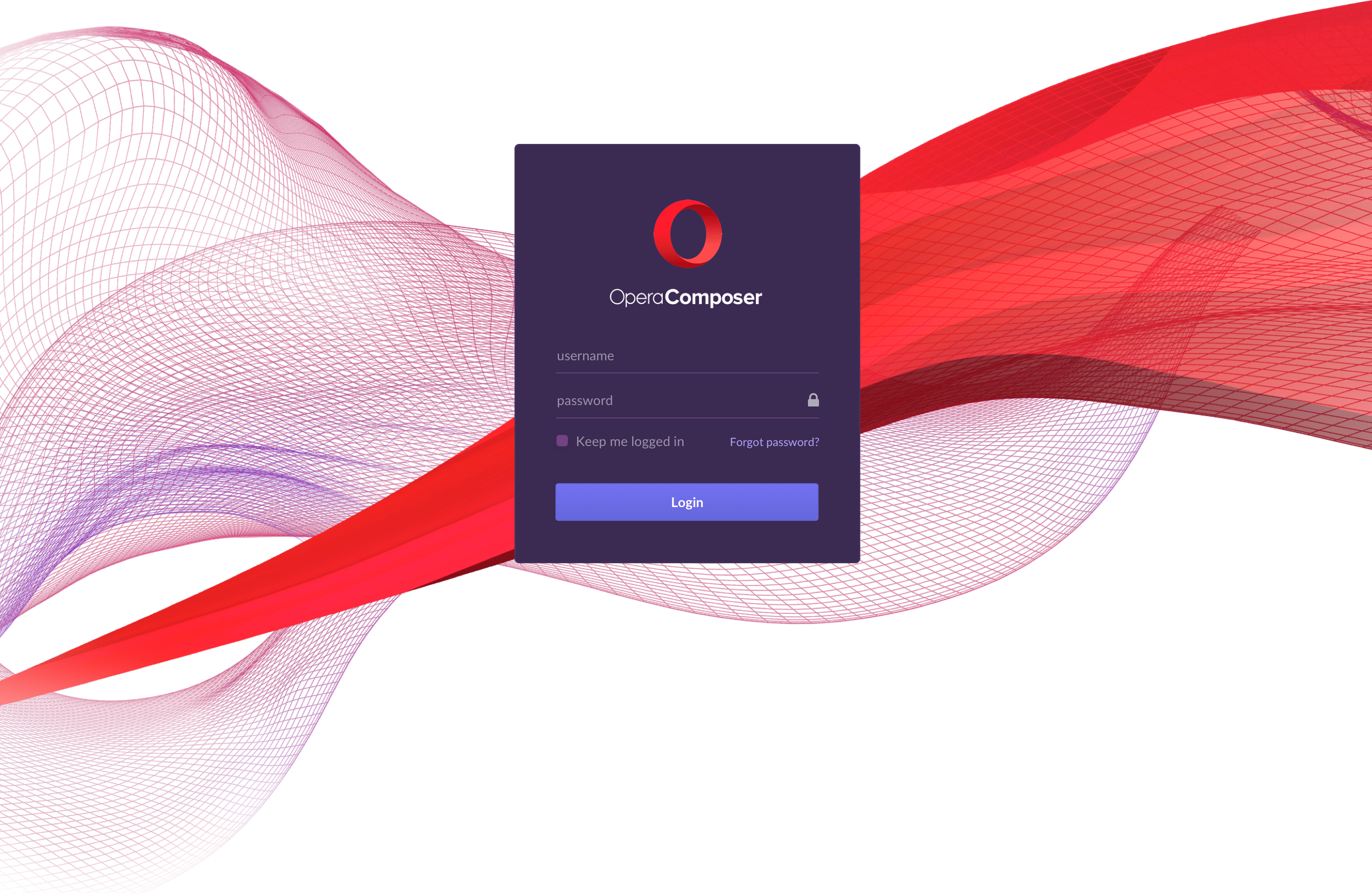
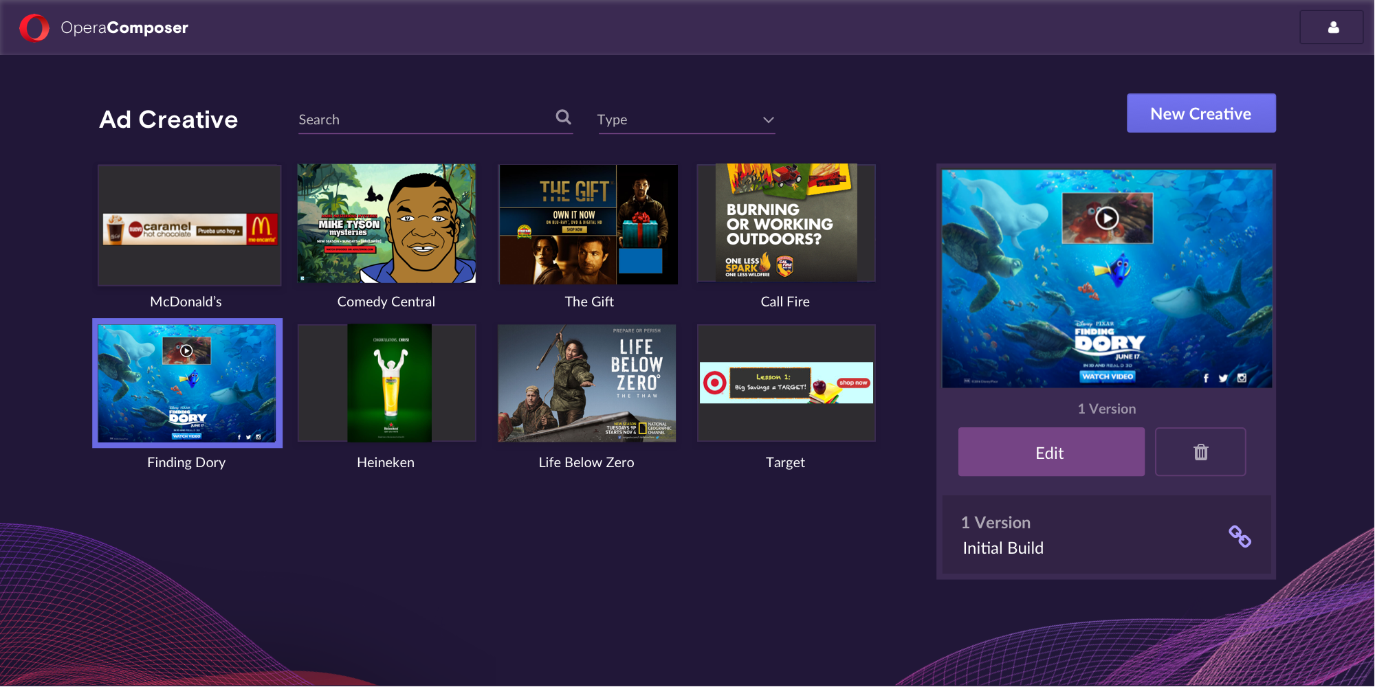
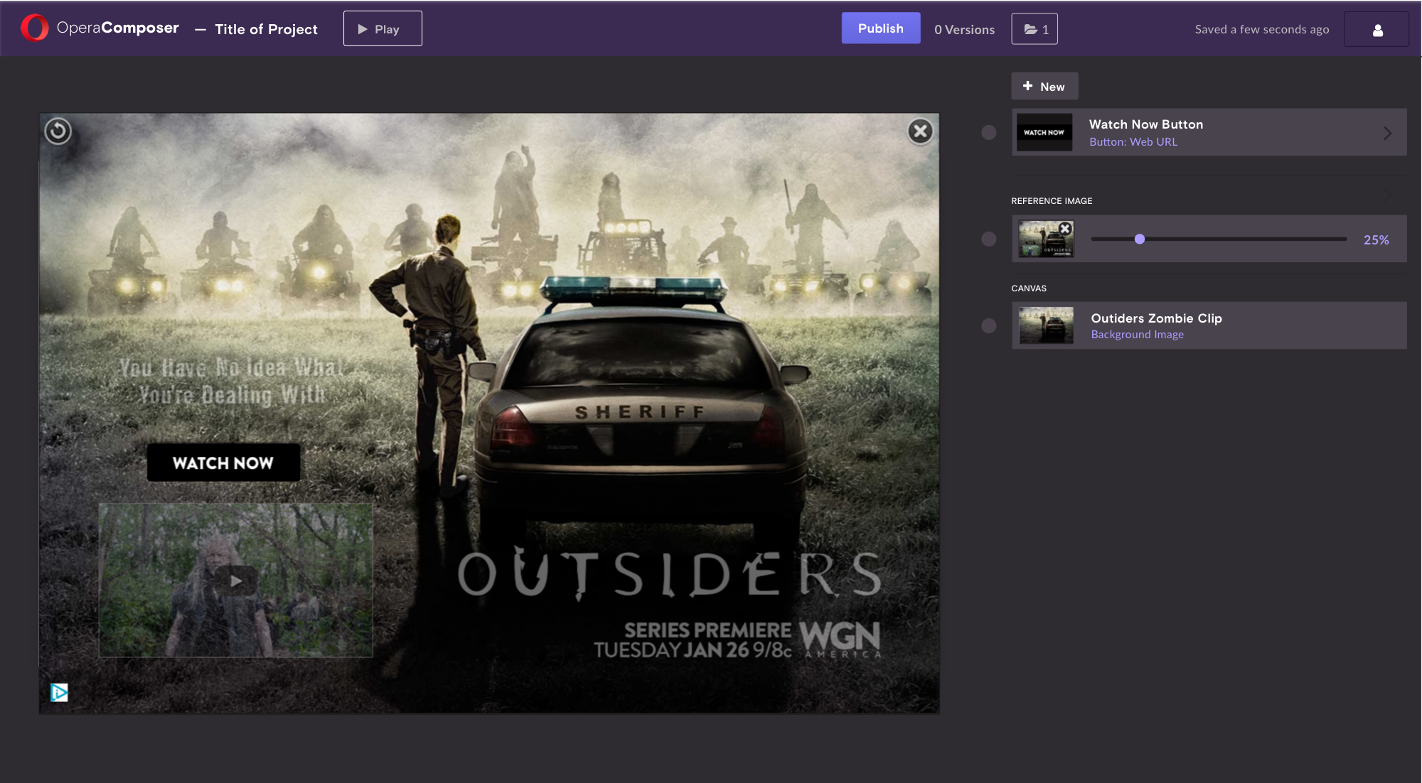
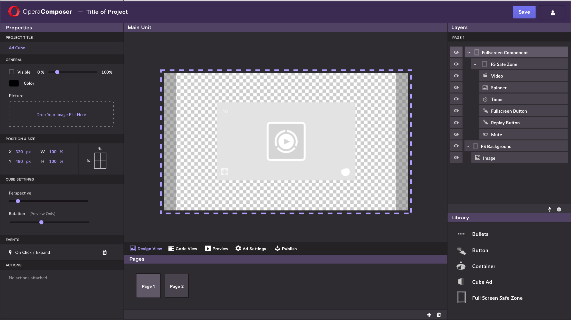
We set out to identify the user’s flow (login screen → ad unit index → ad creation tool → publish link), specify each section that needed custom styling, and note common elements to share across all interfaces. Along the way were countless panels, media uploads, and ad settings, but with consistent styles and UI patterns, a unified visual language emerged.
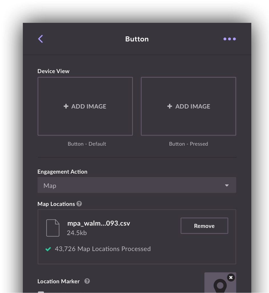
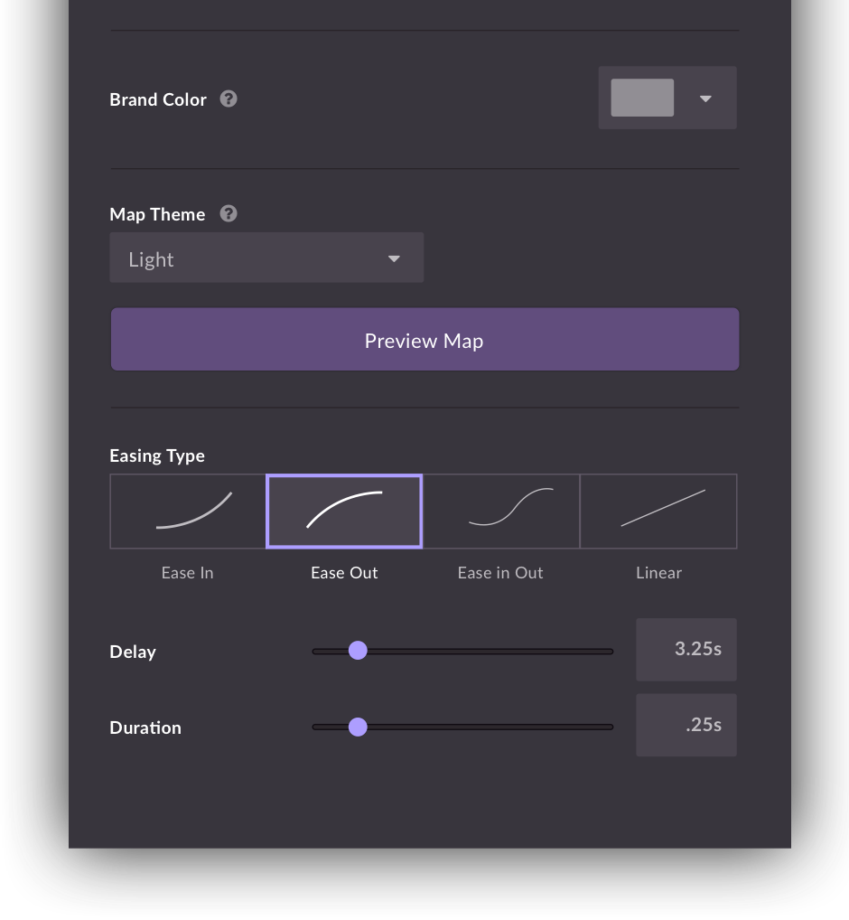
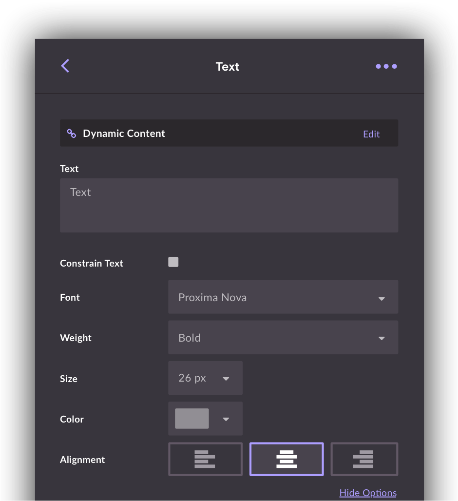
Here's a sample of the final screens.
In 2016, Opera launched a companywide rebrand. As part of that effort, we remade OperaComposer, an internal tool used to format ad units and generate links for the delivery server. The catch? The current tool consisted of two very different interfaces run by separate teams, one in California and the other Germany.
So being careful to mind the time zone, we set out to identify the user’s flow (login screen → ad unit index → ad creation tool → publish link), specify the each section that needed custom styling, and note common elements to share across all interfaces. Along the way were countless panels, media uploads, and ad settings, but with consistent styles and UI patterns, a unified visual language emerged.
Here's a sample of the final screens.
